Tesco Wine • Designing an app

The print edition of Tesco Wine magazine
“The app was designed to link editorial content to direct in-app purchasing”
Brief
Having worked on the redesign of the print edition of Tesco Wine magazine, the client wanted to see how the content could work on a digital platform.
Concept
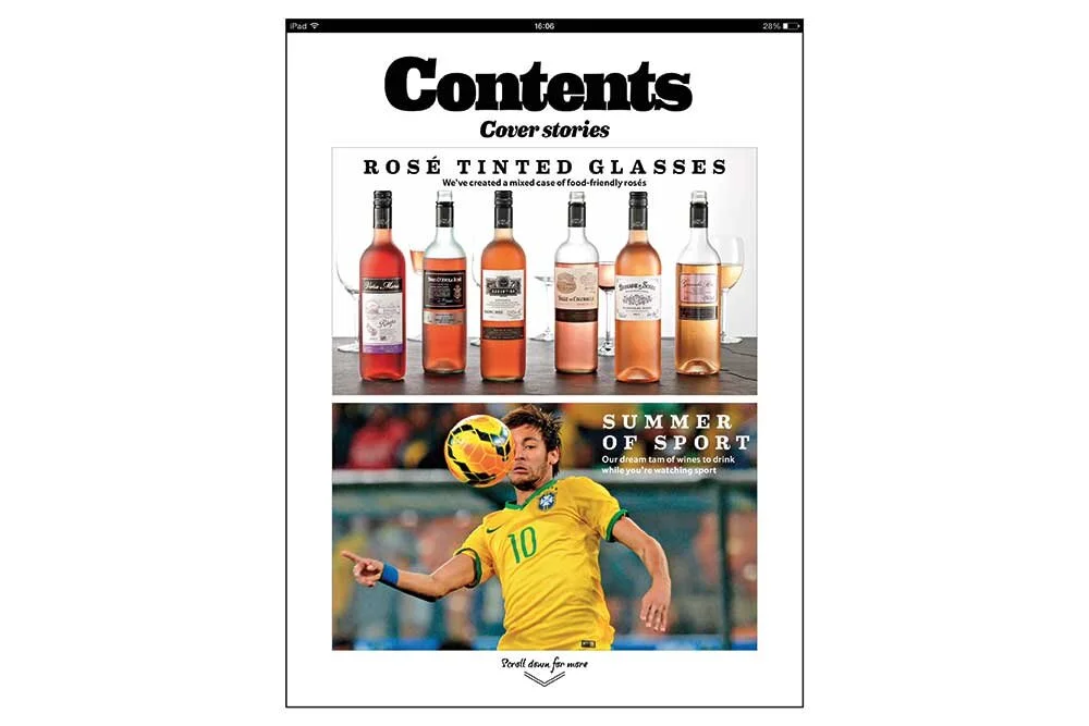
I wanted the app interface to be simple, easy to use and pleasing to the eye. Generous white backgrounds and simple grid layouts would set off bright and natural light photography used in the print edition of the magazine. I was also keen to incorporate some fun interactive elements, like maps that could take you to different wine regions when tapped and extra content displayed in pop ups.
Process
The challenge here was to turn pages that had been designed for paper-based editorial into clean and structured single screens that could be tapped to either take you through to the Tesco wine ordering website or to extra content. I designed a library of furniture including scroll arrows, menu bar icons and buttons and then used app prototyping software to build the design.
The team
Client Tesco Wine
Agency Bookmark
The finished prototype